Drawing for comics
Drawing is fluid. It’s influenced so easily by mood, surroundings, tools, and visual diet. I feel like my drawing style shifts like the seasons or even the weather. I can feel like hard lines one day, then soft watercolours, then the lineless smoothness of oil textures. My preferences are iridescent and shift with the slightest movement of thought. And while this can be a strength for single illustrations, it’s not possible for me to use this ever-shifting array of style-moods in comics.
The visual style of a comic is a crucial part of the storytelling vocabulary. A switch from hard lines to soft watercolours needs to have a similar shift in the mood of the story, not just the mood of the author at the time of creating that particular piece of the story. It’d be jarring, and irritating to be buffeted around on the moods of the author like that.*
Comic making (at least how I do it) is a relatively nonlinear process. Or more often it’s a series of loops. I’ll run through the story in notes, then in drafted words and thumbnails, then with pencils, inks, colours, and finishing with lettering. It’s a long distance track race, it takes time. And since I am a human person with thoughts, feelings, and emotions, I’ll likely have quite a few while I’m making the comic.
So I need to establish rules for myself before I can step into the turbulent waters of making a comic. Otherwise my moods will run a stylistic storm through my work and it’ll feel like chaotic debri to anyone trying to read it. Establishing style guides is standard in any large scale piece of work, especially if you need to work on it with more than one person. Even working by myself it’s important I have strong references in place so I can trust I’m doing the best visual storytelling. Otherwise I’m prone to getting distracted experimenting with a new brush or shading technique I saw somewhere, or changing stylisations or abstractions partway through.
Characters
The biggest thing about making sure the story of a comic shines through for me, is the characters.
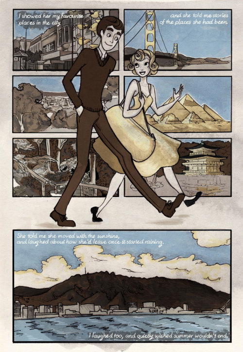
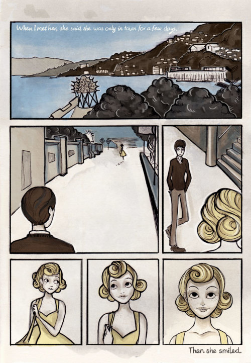
Character design has always been a favourite thing of mine. I love thinking of new costumes, new personalities, new relationships and the way these things intersect and could be represented within their designs. In Sunshine I made the conscious choice to go for swooping curls and curves with her design, combining with the A-line of her yellow frock to make her feel like someone who’d stepped out of the sunlight. I went for ovals and angles to make up the narrator character, and his soft brown colour palette alluded to his grounded nature. The comic itself played with this, using only yellow, brown and blue to colour the story.
But for all the thought that I put into it, and all the expression I felt I captured within Sunshine, I still feel like there was something missing from the way I illustrated the characters (I’m allowed to say this, because I wrote Sunshine in 2012 so it’s officially old now and critique is how we improve). There’s just something about the way that they’re represented on the page, how they hover and shift slightly off-model, the way they interact with each other and within the context of their story. It’s just not exactly right, but I couldn’t at the time put my finger on exactly why that was.
I’ve done a lot of learning, a lot of reading, and a lot of drawing since Sunshine, and I’m hoping I can use some of that to improve. And I think I can actually say that I have.
The new story
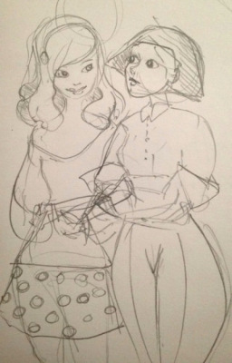
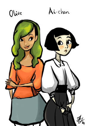
Here’s the first sketches I did of my new characters for my new fiction story, Circuits and Veins. It’s probably going to be a bit longer than the comics I’ve been putting out recently, but I haven’t gotten into the actual writing part of the project yet so I don’t know. Their names here are Olive and Ai-chan and here they’re fresh baby characters still finding their feet.
I like them a lot, and the story I built around them is something I’m really pleased with and think will be really interesting. But when I look at these sketches and tests I get the same not-quite feeling I had with Sunshine, and I just know that I need to push a bit harder this time and get past that. I tried, but I got more of the same. Or slightly different, but same result.
It’s nice, they’re nice. But I felt like this story needed something more than nice. I need something more than nice.
So I put them to sleep for a while and worked on other stuff. They’ve been mulling slowly for a long time, and I’ve kept learning and thinking about how it is I want them to look and behave. In between thinking about building on my autobio comic stuff while I was in Japan, I was also thinking about these two. Now I think I’m finally ready to pick this story up again.
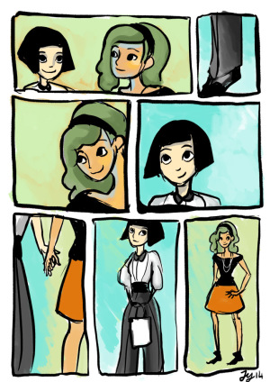
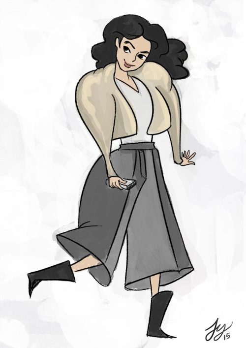
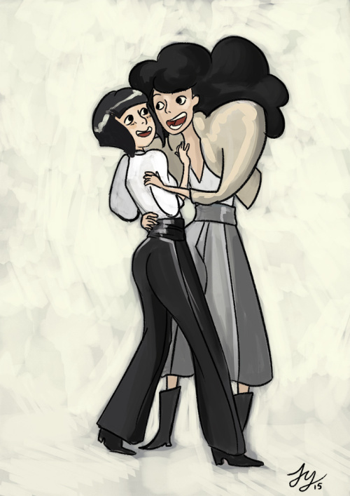
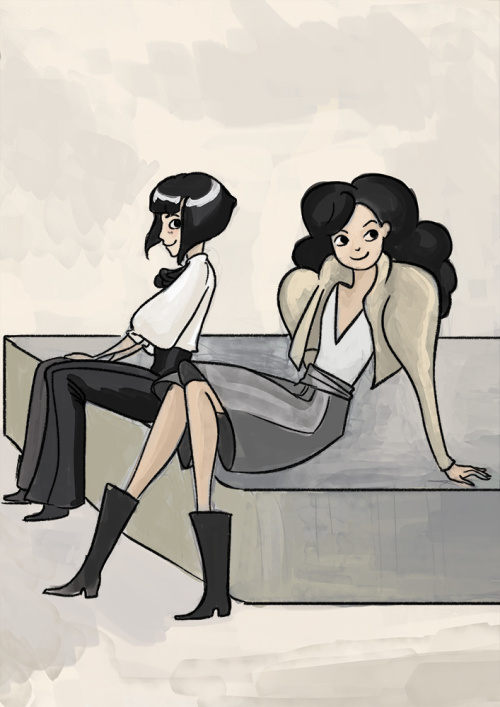
I’ve completely redesigned Olive. She’s now called Yuki (幸, meaning Happiness). I imagined her character to be relatively socially outgoing, so I wanted her extroversion to be more aparent in her design and attitude. I made her clothes bigger, so she’s visibly taking up more space than her frame. I wanted to keep her textured hair, but since her design was going loud shape-wise, I felt that a more monotone colour palette was a good way to balance her design visually. I also wanted to make her a bit more visibly Japanese.
I still really like the design for Olive, and she will likely play a part in the story. But I think Yuki will be a more interesting lead/co-lead.
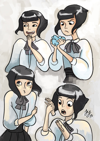
Ai’s design has stayed mostly the same, but she’s now much more visibly emotive. I really liked Ai’s initial design, but her personality has been hard to pin down, which for me made her harder to draw. As she’s an android, I wanted to avoid the absence of a personality that is a common trop with androids, especially girl ones. I wanted her to have a developed personality that suited her. I found it hard to even pick a stylistic way of representing her because it was hard to know exactly what part of her I was trying to represent. She was trying to be too much at once.
These are quick emotion tests to see how I felt giving Ai more space to visually emote, rather than hide it. I like where this is going, and I feel like I understand what I want to do with her character a lot more than the coy, slightly absent android I was first sketching.
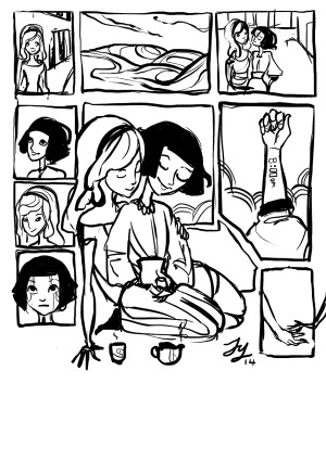
The visible expression of their personalities in their designs makes it much easier for me to put them together, and much more interesting things seem to be happening than were before.
Yeah, I like this.
Perhaps it’s more of an attitude shift on my part than anything else. But I think this is definitely the best thing for this project, and I think it shows how much I’ve grown as a comic artist since Sunshine.
Now, back to drawing!
* There are exceptions, and I’d potentially like to try something a bit more chaotic one day, but it’ll be on a day where I have a story that suits this being incorporated into the storytelling.
